
Government | UX/UI Design
Modernising a centralised community data source
Reimagining a government organisation’s corporate website, focusing on bilingual accessibility, intuitive navigation, and stakeholder-driven content architecture. The project delivered a tested information architecture, prioritised requirements, and design concepts that reflect the diverse needs of the organisation’s regional audiences.
Project overview
The organisation sought to modernise its corporate website to better serve a multilingual and multi-stakeholder audience across the Pacific region. The existing site presented challenges in navigation, accessibility, and content relevance - particularly for French-speaking users, youth, NGOs, and media representatives.
The project team conducted discovery sessions, card sorting workshops, and white site testing to understand user needs and validate a proposed information architecture (IA).
The outcome was a user-centred roadmap for redesign, including functional and non-functional requirements, design concepts, and a strategic plan for future development phases.
My team and role
As Lead UX Designer, I collaborated with stakeholders across the organisation’s divisions, partners, and community representatives. My responsibilities included:
Facilitating discovery sessions and card sorting workshops
Designing and testing a proposed IA structure
Synthesising qualitative and quantitative feedback from over 50 stakeholders
Creating responsive design concepts in Figma for desktop and mobile
Documenting functional and non-functional requirements and prioritising them using the MoSCoW framework
Supporting bilingual accessibility and inclusive design principles
Design prototypes | Figma
Discover -
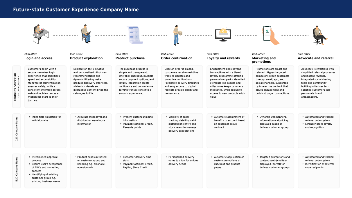
Stakeholder engagement and persona development
We engaged over 50 stakeholders, including Pacific Island People, NGOs, donors, media, and staff. Discovery sessions revealed key pain points: difficulty locating information, language barriers, outdated content, and inconsistent navigation.
Persona profiles were developed to represent user groups and guide design decisions.
Persona profiles
Define –
IA testing and requirement prioritisation
A card sorting workshop and white site testing with 50+ participants helped refine the IA. Tasks with low success rates (e.g. locating key pages) informed key recommendations.
Requirements were prioritised using the MoSCoW method, resulting in 152 functional and 55 non-functional items.
White site (IA) testing | Optimal Workshop
Ideate –
Design concepts and navigation models
Design concepts were created in Figma, showcasing responsive layouts, mega menus for desktop, and drawer menus for mobile. Key pages included Members, Stories, and Events, with features like filtering, tagging, and interactive data visualisations. The designs emphasised accessibility, bilingual support, and cultural relevance.
Design prototypes | Figma
Validate –
User testing and feedback loops
Feedback from white site testing and discovery sessions highlighted areas for improvement, such as renaming categories (e.g. “Work With Us” to “How We Work”), repositioning pages (e.g. Accountability), and clarifying acronyms. Participants also requested better visibility of media resources, donor contributions, and regional data.
Feedback sessions
Deliver –
User testing and feedback loops
A componentised design system was established to support scalable development. The final deliverables included design concepts, a comprehensive document of prioritised requirements, and a strategic timeline targeting the proposed launch timeline.
Discovery and design report
Our solution
The proposed redesign delivers a responsive, bilingual, and user-first experience tailored to the organisation’s diverse audiences. With a tested IA, inclusive design concepts, and a robust requirements framework, the solution lays the foundation for a scalable and accessible digital platform that reflects the organisation’s values and strategic priorities.
The impact
Improved navigation through tested IA and intuitive menu structures
Enhanced accessibility with bilingual support and WCAG 2.2 compliance
Streamlined content discovery via federated search and filtering tools
Stronger stakeholder engagement through tailored personas and feedback loops
Scalable design system enabling consistent branding and rapid iteration
Strategic alignment with the organisation’s goals for transparency, inclusivity, and digital transformation