
Government | UX/UI Design
Designing an accessible platform for a multilingual community
Redesigned a multilingual public service website to improve accessibility, streamline interpreter application pathways, and modernise authoring capabilities - delivering a WCAG-compliant platform optimised for language diversity and responsive user journeys.
Project overview
The project was about more than visual uplift; it was a transformation of the user experience, platform architecture, and content governance model - ensuring that people from all language backgrounds could successfully navigate, understand, and use the service.
Role and team
As the lead UX/UI Designer, my role focused on designing a responsive, accessible and user-first experience. Key responsibilities included:
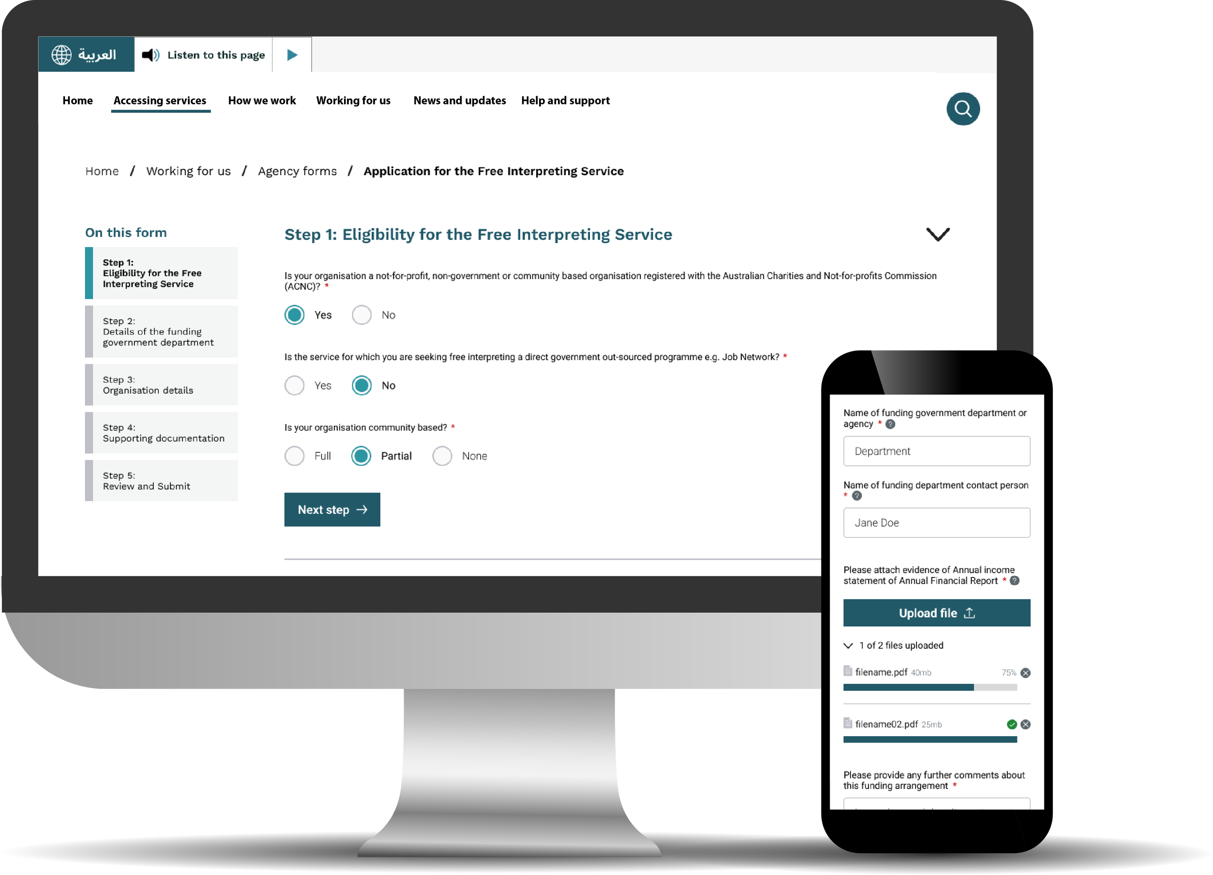
Creating end-to-end flows for critical service calculators and application tools
Mapping user journeys and form logic alongside SMEs and business stakeholders
Designing a responsive user interface design in Figma for desktop, tablet, and mobile
Collaborating with developers to support specific design decisions e.g. alternate layouts right-to-left language formatting for Arabic language
Leading the creation of a bespoke design system and component library
Ensuring all designs met WCAG AA accessibility standards
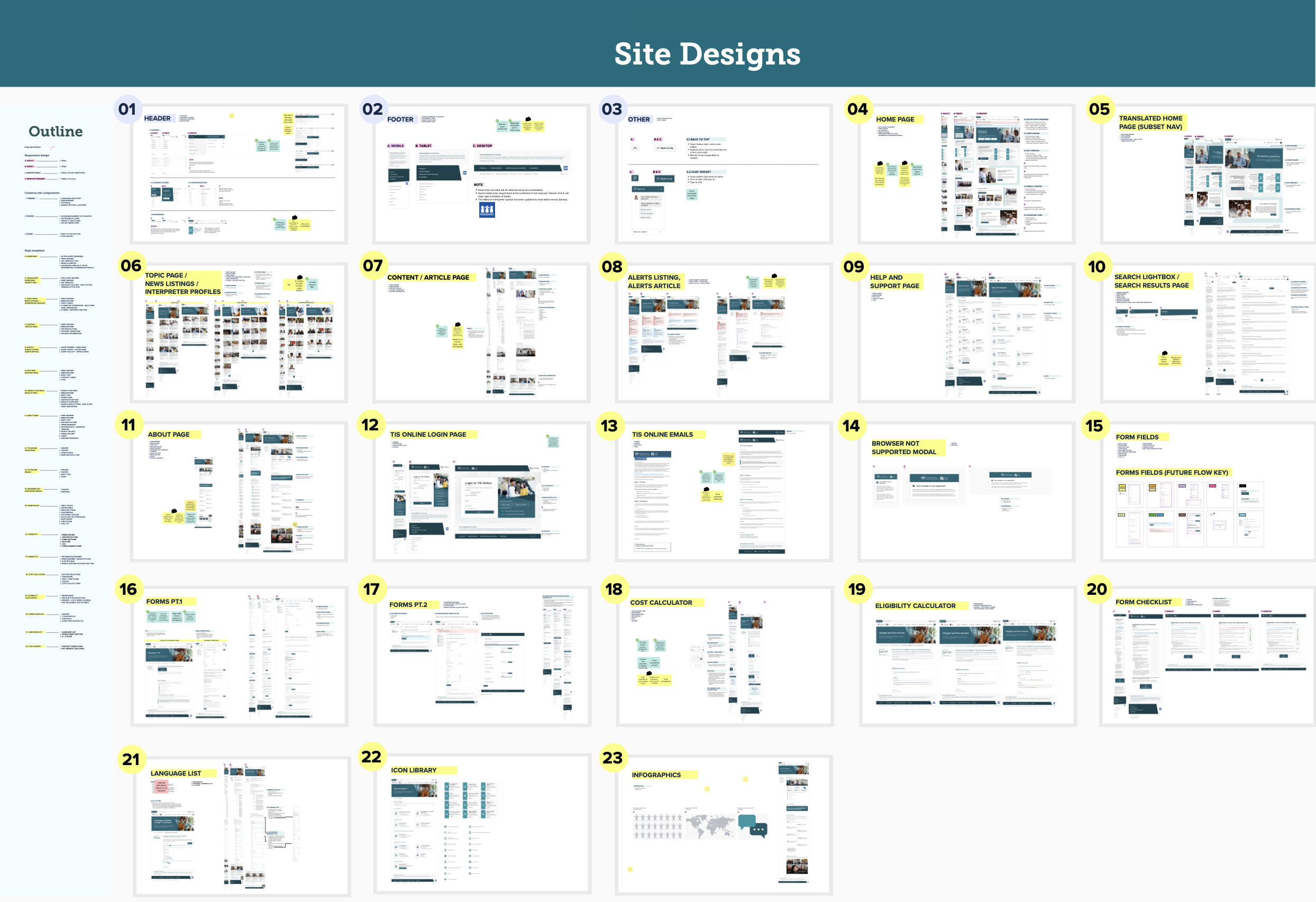
Design prototypes | Figma
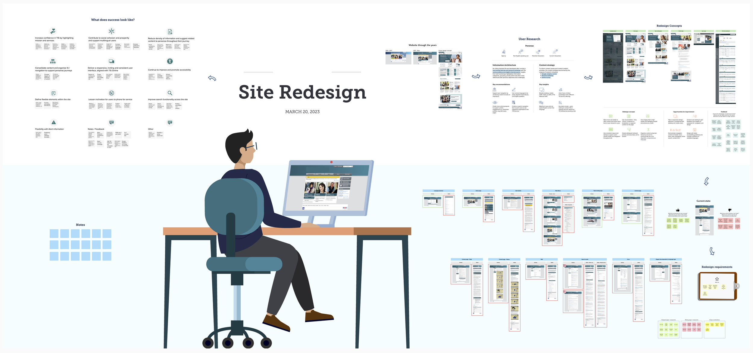
Design process overview
Our approach followed a user-centred methodology tailored to the needs of diverse language users.
-
The project began with a deep dive into the needs of a multilingual audience. Workshops were held with product owners, content authors, and interpreting service administrators to uncover pain points in both customer-facing pathways and internal workflows.
-
Key pain points were identified, including inconsistent navigation, inaccessible layouts for non-English readers, and complex interpreter service flows. Using online collaboration tools such as Mural, the team collaborated with SMEs to map form logic and user journeys, which informed the new information architecture (IA) and key page templates for redesign.
-
A bespoke design system was built in Figma, ensuring scalability and accessibility compliance. Special attention was given to simplifying service tools and application forms, with contextual help embedded to support users navigating in a second language.
-
Iterative refinements were made based on internal reviews and user insights, ensuring alignment with user expectations and operational standards.
-
High-fidelity UI designs were delivered across all major page types and tools. Collaboration with developers ensured compatibility with Sitecore 10 and browser requirements. The final design system empowered content authors with flexible, mobile-optimised templates and a maintainable component library.
To ensure our design direction reflected the true needs of the multilingual audience, we began with workshops involving product owners, content authors, and interpreting service administrators. These sessions uncovered pain points in both customer-facing pathways and internal content workflows.
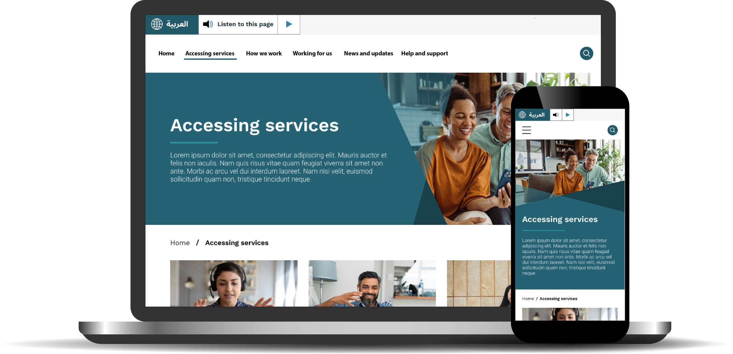
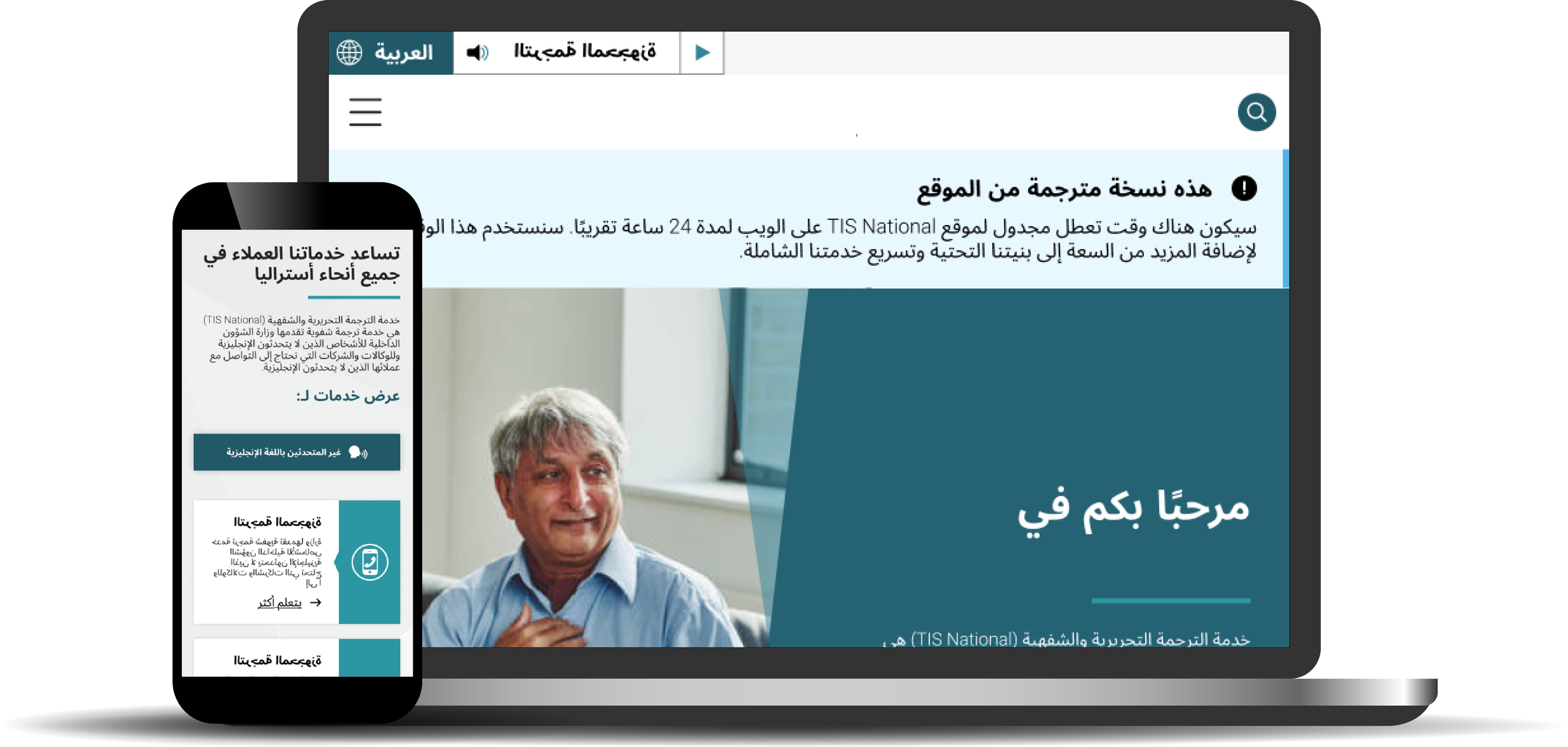
With the platform serving users from various cultural backgrounds and language proficiencies, we examined linguistic accessibility considerations from the start - reviewing content clarity, form layout, and navigation patterns through the lens of multilingual comprehension and mobile usage.
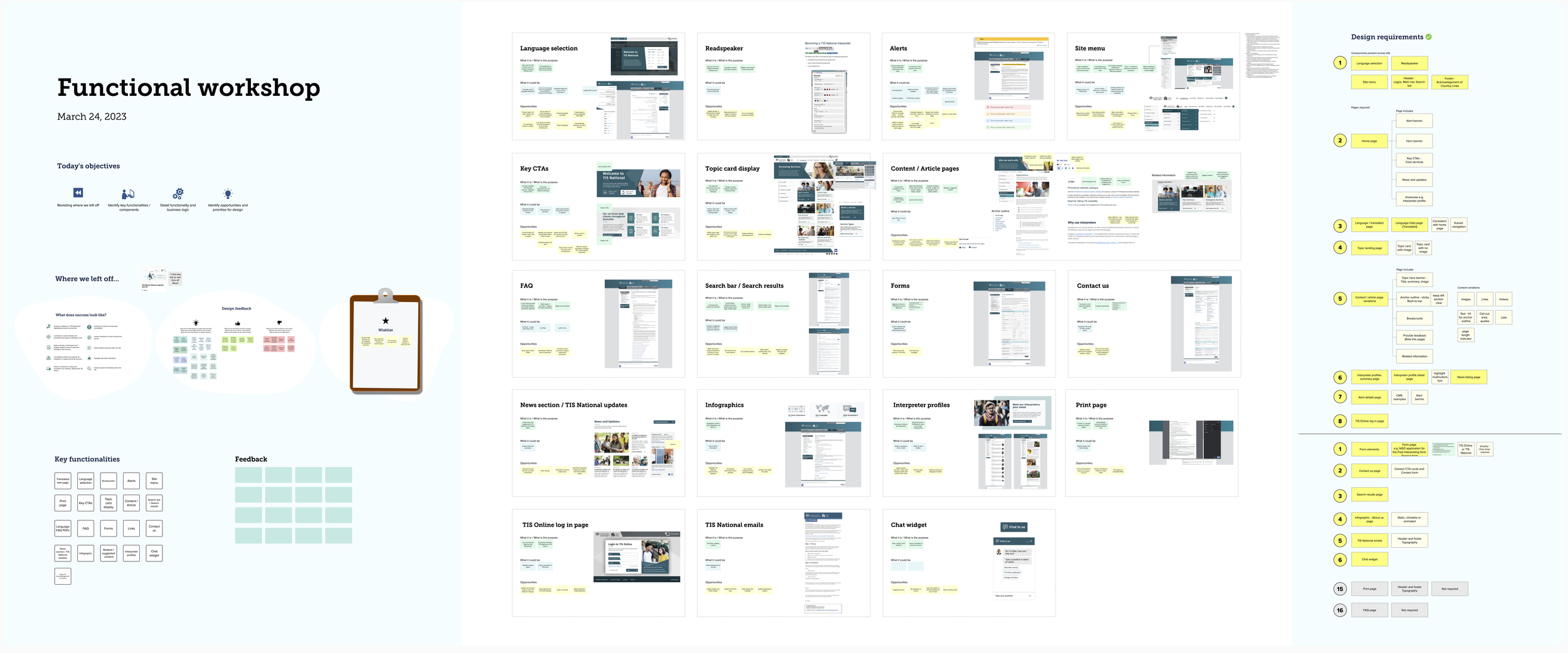
Discovering user insights through stakeholder workshops and interviews
Discovery Workshop | Mural
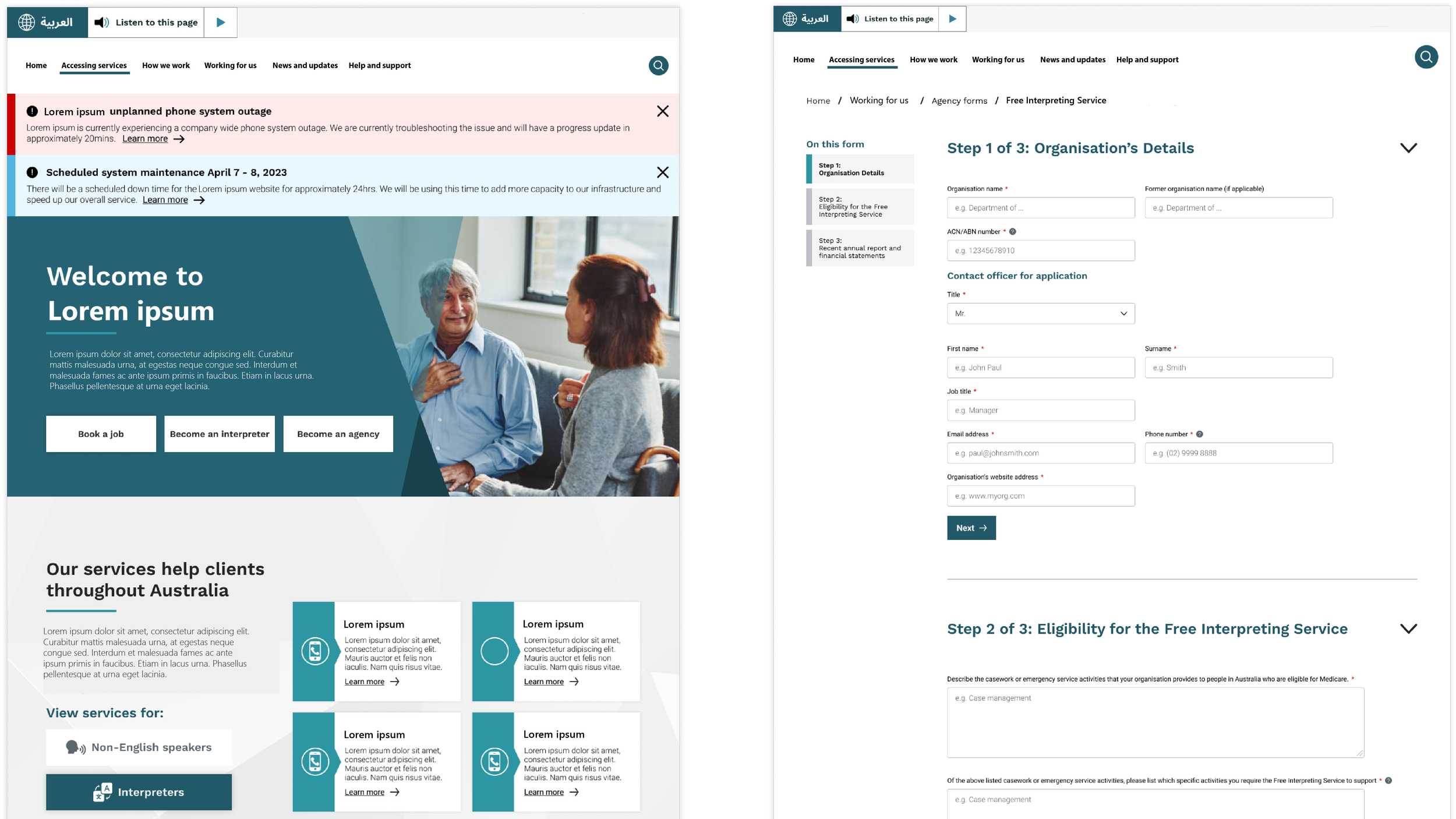
We identified several critical friction areas: inconsistent navigation structures, inaccessible content layout for non-English readers, and unclear interpreter service flows. Additionally, existing tools like eligibility calculators for interpreter support lacked structure and were difficult for users to complete unaided.
We used Mural to map out these forms and calculators collaboratively with SMEs and business leads, ensuring each flow reflected logic that aligned with operational processes and user comprehension goals. This mapping phase formed the backbone of the new IA and informed prioritisation of templates for redesign.
Defining target functionality and user flows
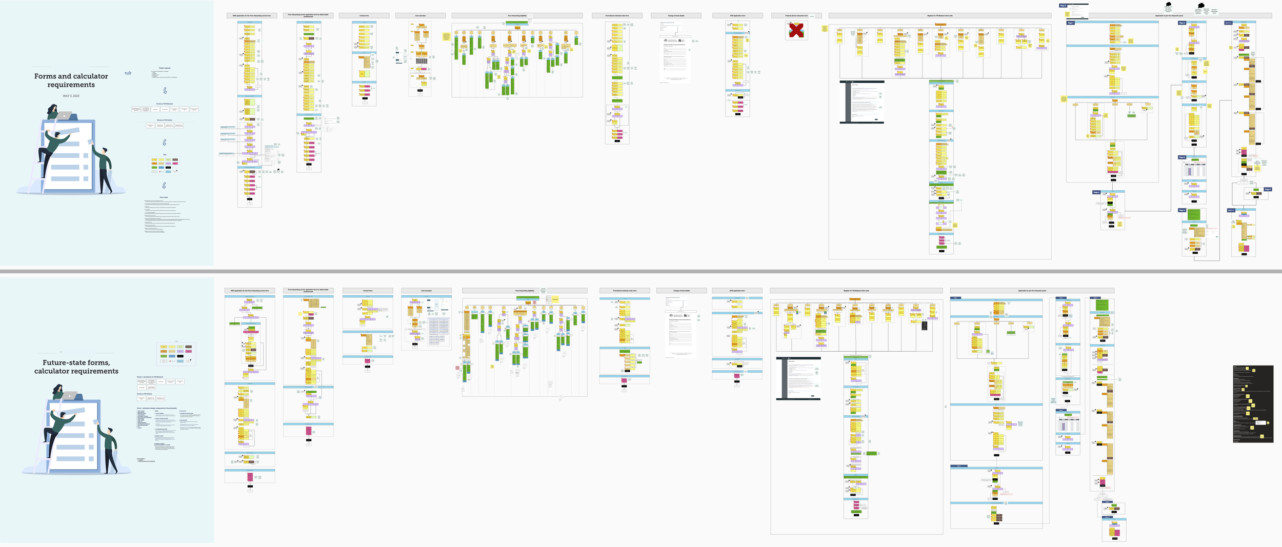
Mapping future-state form requirements | Mural
Functional requirements workshop | Mural
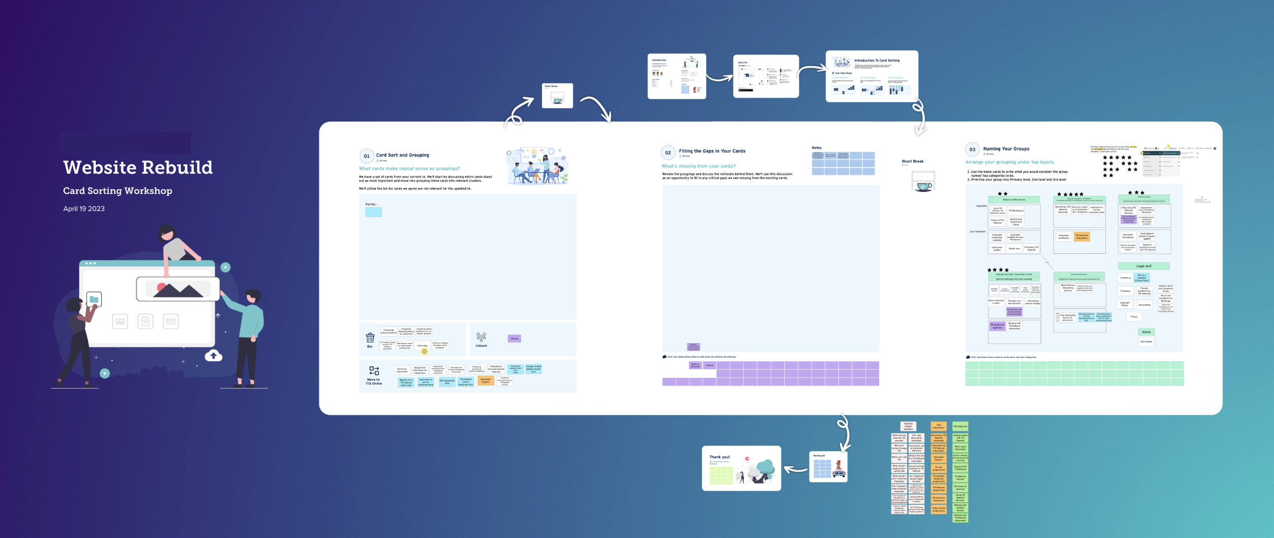
Information Architecture (IA) card sorting workshop workshop | Mural
Ideating wireframes and prototyping
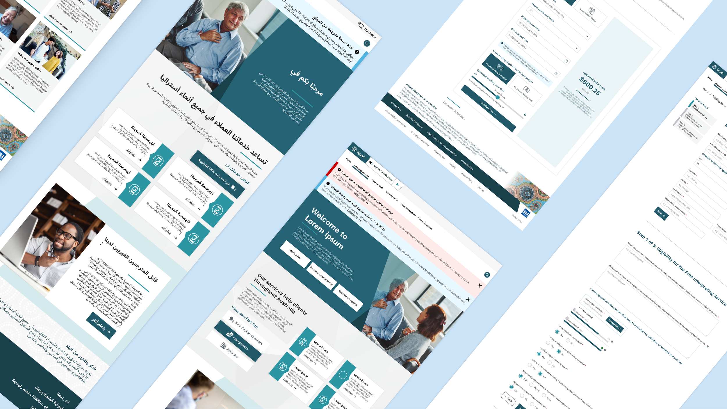
Once we’d defined the problem space, I developed responsive wireframes that accounted for directionality (right-to-left vs left-to-right layouts), screen fluidity, and clarity of content presentation. The goal was to streamline the interface while respecting language formatting norms, for example, maintaining iconography consistency across cultural contexts.
I built a flexible design system from the ground up in Figma, ensuring components could scale with content type and adapt to assistive technologies. The calculator tools were a key focus as we simplified the logic into a series of questions with contextual help to improve comprehension for users navigating in a second language.
Designing for multi-lingual capabilities | Figma
Designing responsive prototypes for testing and development
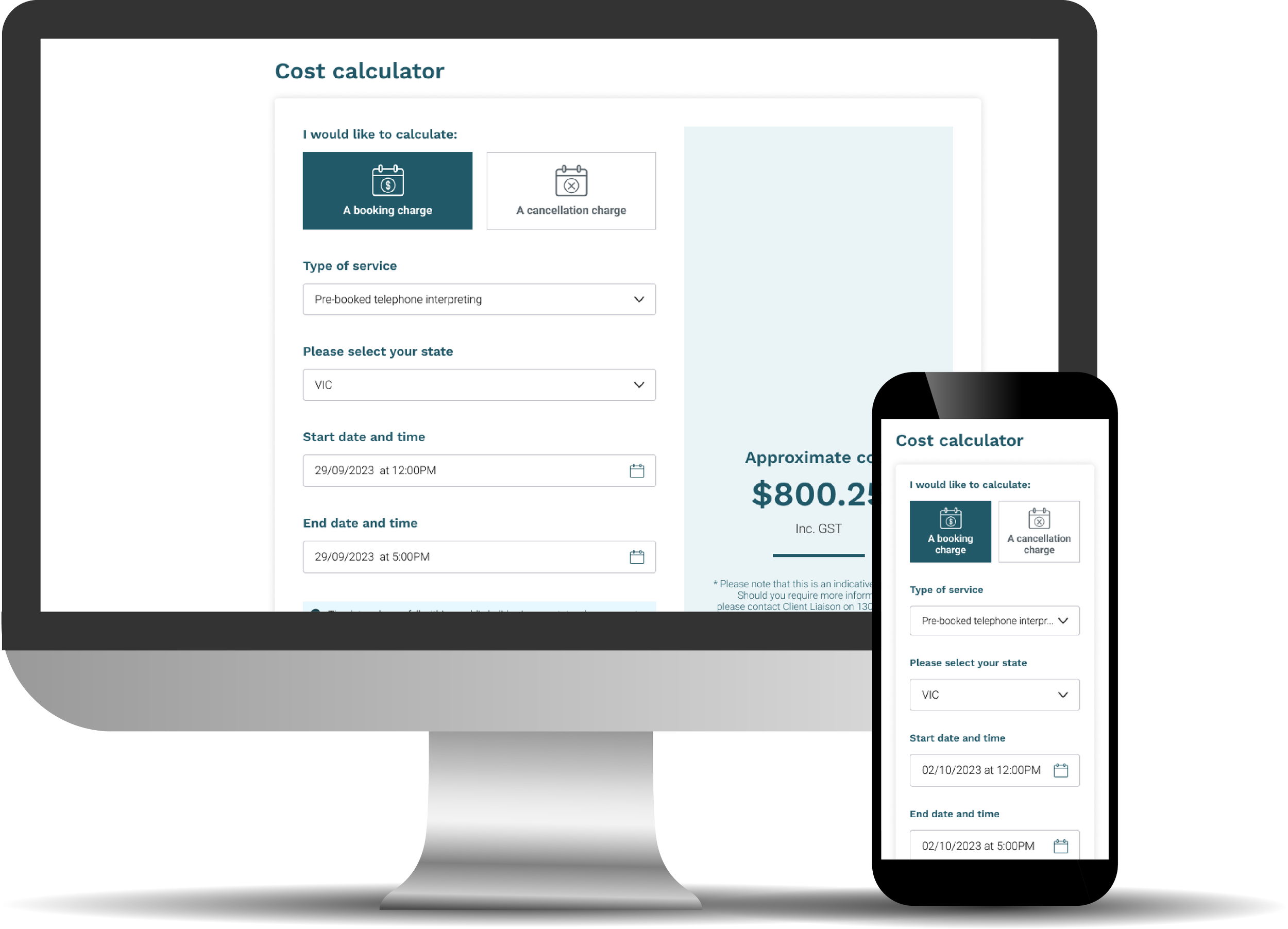
Calculator design
Form flow designs
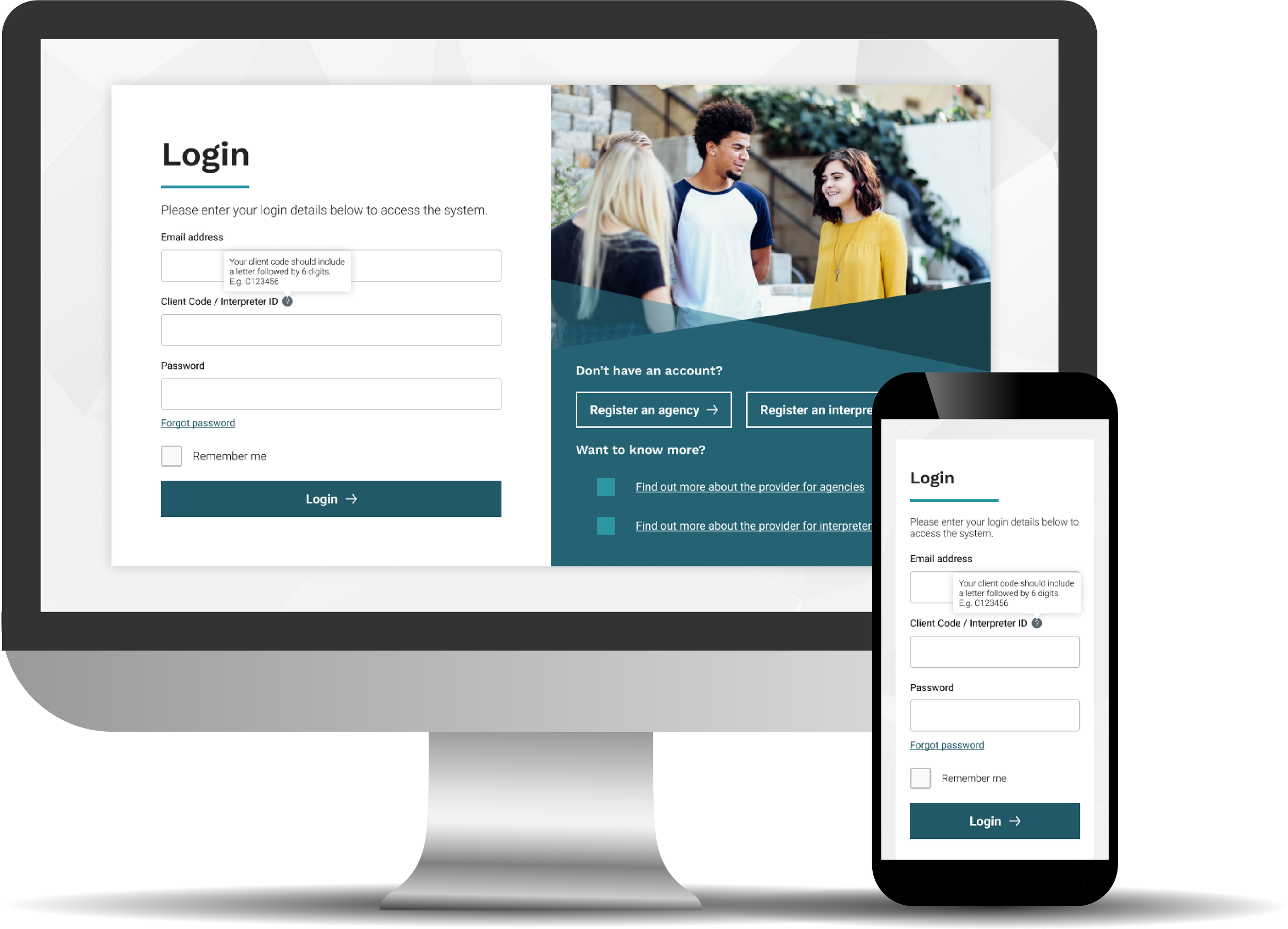
Login process
Validating early and often
Throughout the process, we frequently engaged with internal reviewers and end-user representatives to validate content, functionality and visuals. This included walkthroughs of logic, content structures, and flows to confirm clarity and alignment with user expectations.
We also had regular feedback loops which were structured around sprint demos and design showcases. During these sessions, stakeholders could flag usability and authoring concerns. I also remained closely involved in backlog grooming sessions to help prioritise fixes and refine flows based on the feedback cycle.
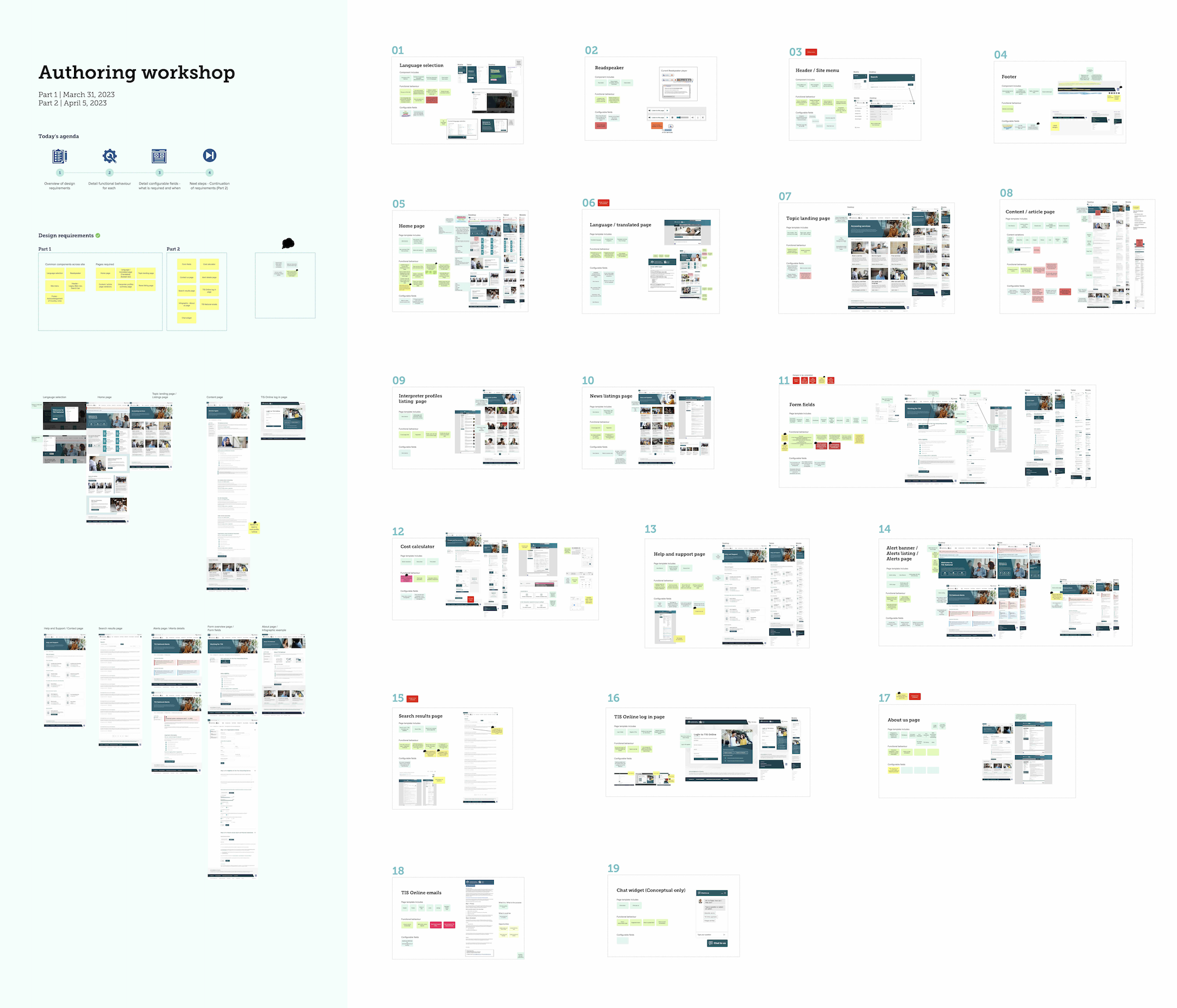
Authoring workshop | Mural
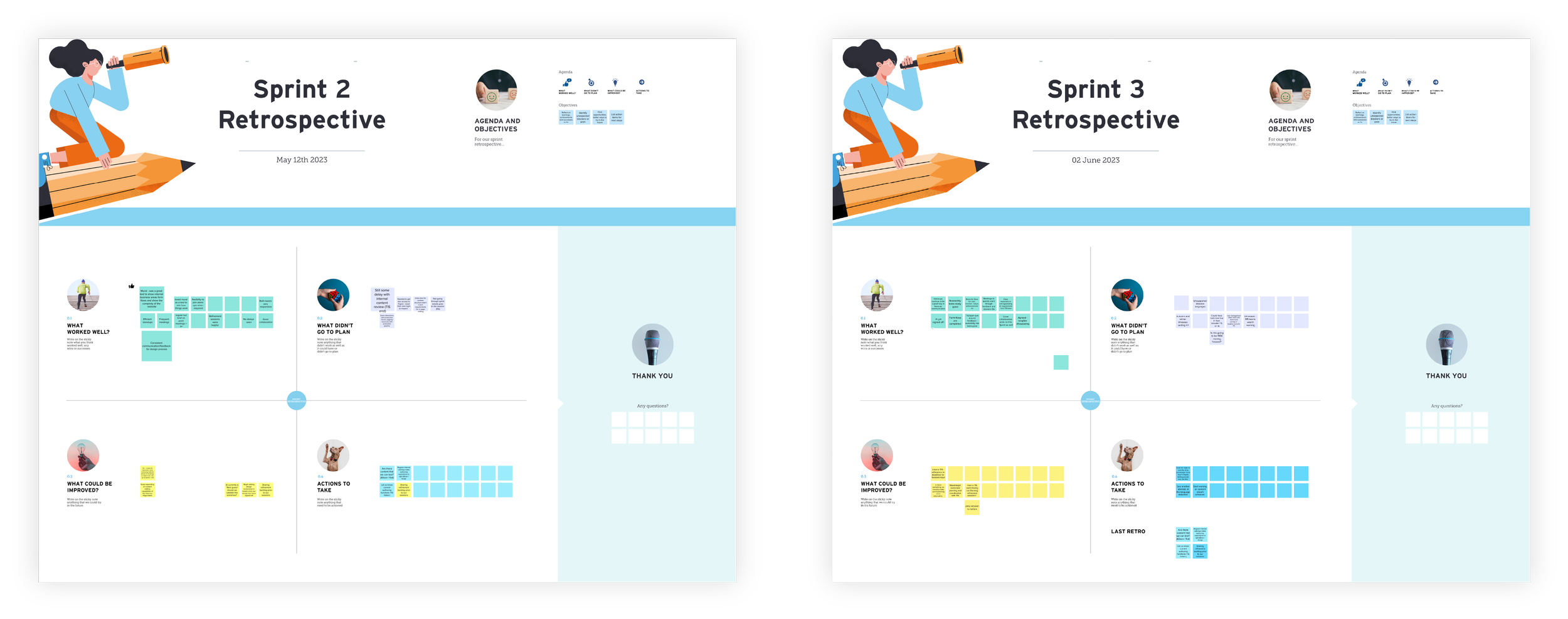
Sprint Retrospectives | Mural
Delivering high-quality designs and functional components
We delivered high-fidelity UI designs across all major page types and calculators, ensuring seamless device responsiveness and support multi-lingual content. I worked closely with the development team during sprint planning and backlog refinement sessions to ensure our designs align with Sitecore 10 functionality and browser support requirements.
The final design system provided a flexible, maintainable component library that met accessibility benchmarks and empowered the internal team to manage content confidently. This included mobile-optimised templates and layout flexibility for evolving service needs.
Design handover | Mural & Figma
Our solution
Our redesigned platform delivered a streamlined, accessible, and culturally inclusive experience that reflects the role of the provider as a nationwide public support service. With smart logic embedded into user flows, language-responsive UI design, and a scalable content system, the solution modernised how non-English speakers and service partners access critical support.
The impact
While post-launch metrics were still being gathered, key qualitative improvements included:
Faster interpreter request completion via simplified tools.
Seamless language switching and improved readability across devices.
A WCAG-compliant, responsive platform aligned with inclusive design principles.
Stronger content authoring workflows powered by Sitecore 10.
The result was a scalable, user-first foundation that empowered the client to serve Australia's multilingual communities more effectively and securely.