Financial services | UX/UI Design
Streamlining an online application process
Streamlined complex digital application processes for a key financial services provider - designing form flows, introducing accessibility-first pathways, and leveraging user research resulting in a 365% uplift in completed applications.
Project overview
The bank sought to modernise its online account opening (OAO) process. With increasing digital maturity and a broader user base, the bank needed an improved, streamlined experience that would boost conversions and enhance accessibility.
Role and team
As the UX/UI Designer, I worked alongside our project lead, business analysts, developers, and key client stakeholders. My primary focus was to develop a design system for the bank - building prototypes, and ensuring our design solutions met both user needs and regulatory compliance. My core contributions included:
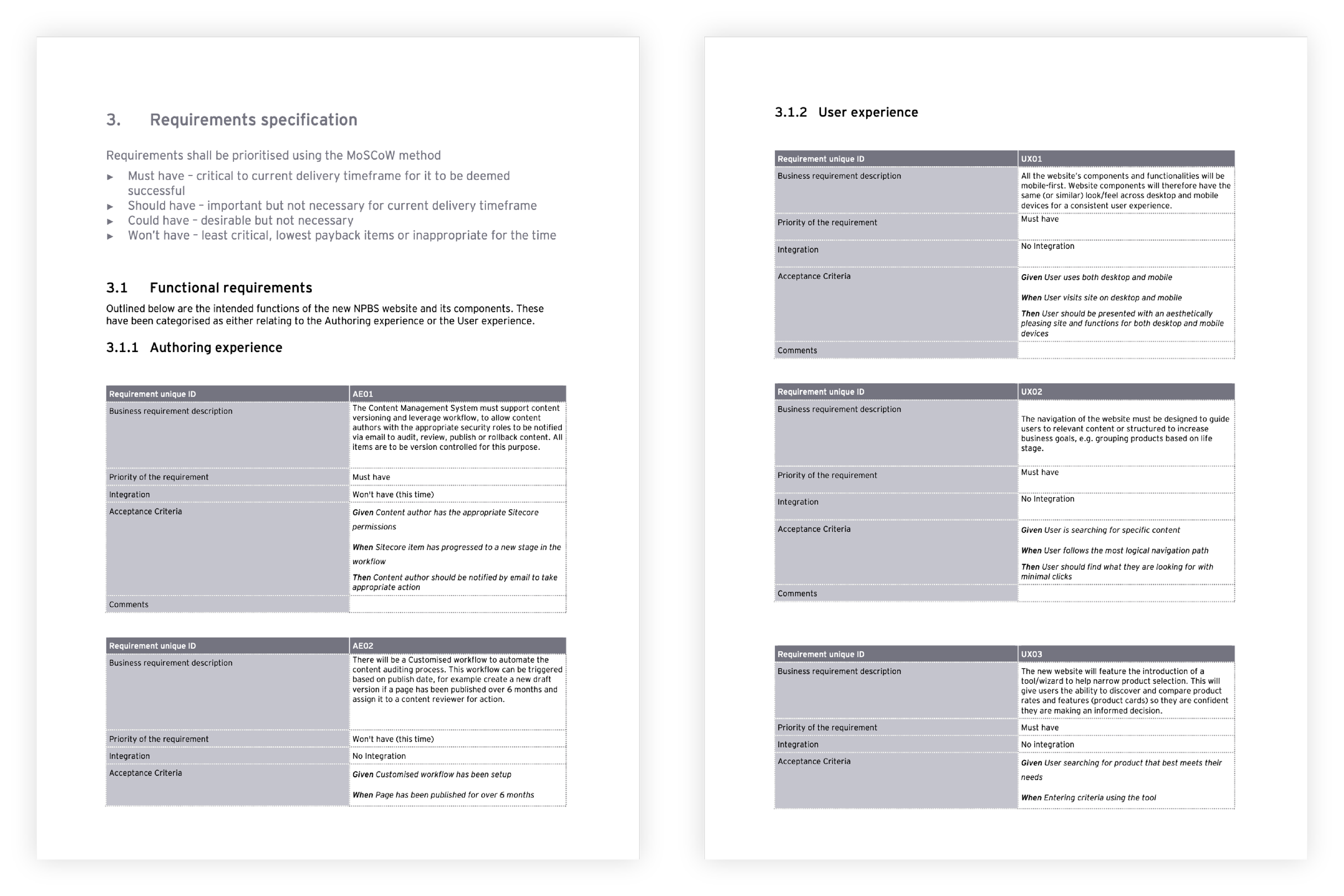
Establishing a UI design system for the OAO processes.
Creating flow maps, wireframes, and prototypes.
Conducting user research and usability testing through workshops and focus groups.
Ensuring compliance with banking regulations and accessibility standards.
Collaborating cross-functionally with developers, analysts, and SME stakeholders.
Design prototypes | Figma
Design process overview
Our approach followed a human-centered design process.
-
Research, user insights, stakeholder interviews
-
Pain points, behavioral patterns, customer goals
-
Wireframes, journey mapping, prototyping
-
Usability testing, stakeholder engagement
-
High-fidelity UI, developer collaboration, iterative improvements
Discover: Research, user insights, stakeholder interviews
At the outset, we immersed ourselves in the business context and customer needs. Our team conducted branding and market research to benchmark user expectations and identify opportunities to differentiate the bank in a competitive landscape. Through stakeholder interviews, we aligned on business goals and constraints, ensuring our design approach would be grounded in both user-centricity and operational reality.
We facilitated collaborative workshops with end-user representatives and subject matter experts (SMEs) from the bank to understand key pain points in the current account opening process. These sessions, coupled with competitive analysis and demographic exploration, allowed us to build informed personas and map user journeys grounded in user needs.
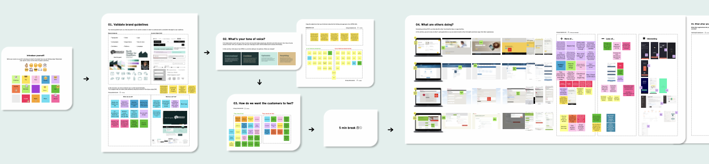
Discovery workshop | Mural
Define: Pain points, behavioural patterns, customer goals
Synthesising our discovery insights, we identified key friction points in the existing workflows particularly around accessibility, form complexity, and limited digital options for the bank’s youth and joint applications. We mapped behavioural patterns such as drop-off rates and abandonment triggers, giving us a more strategic lens on where design improvements would have the most impact.
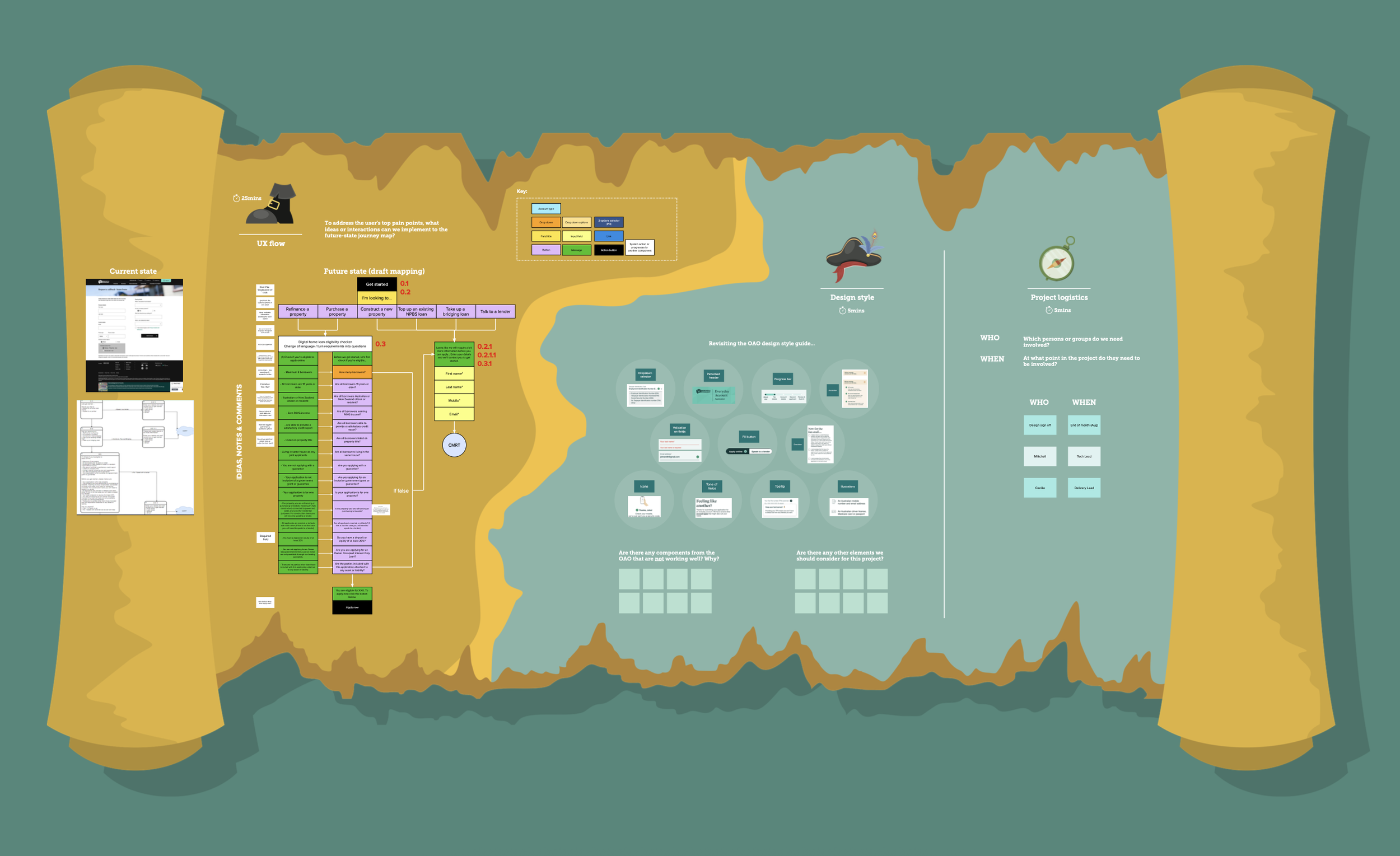
To structure our approach, we mapped the end-to-end future-state flow maps for each of the bank’s eight Online Account Opening (OAO) forms. These were developed in Mural, capturing validation fields, conditional logic, and pain points from both a customer and operational lens. This foundation enabled us to balance the creation of a user-friendly flow within the boundaries of the bank’s systems and compliance obligations.
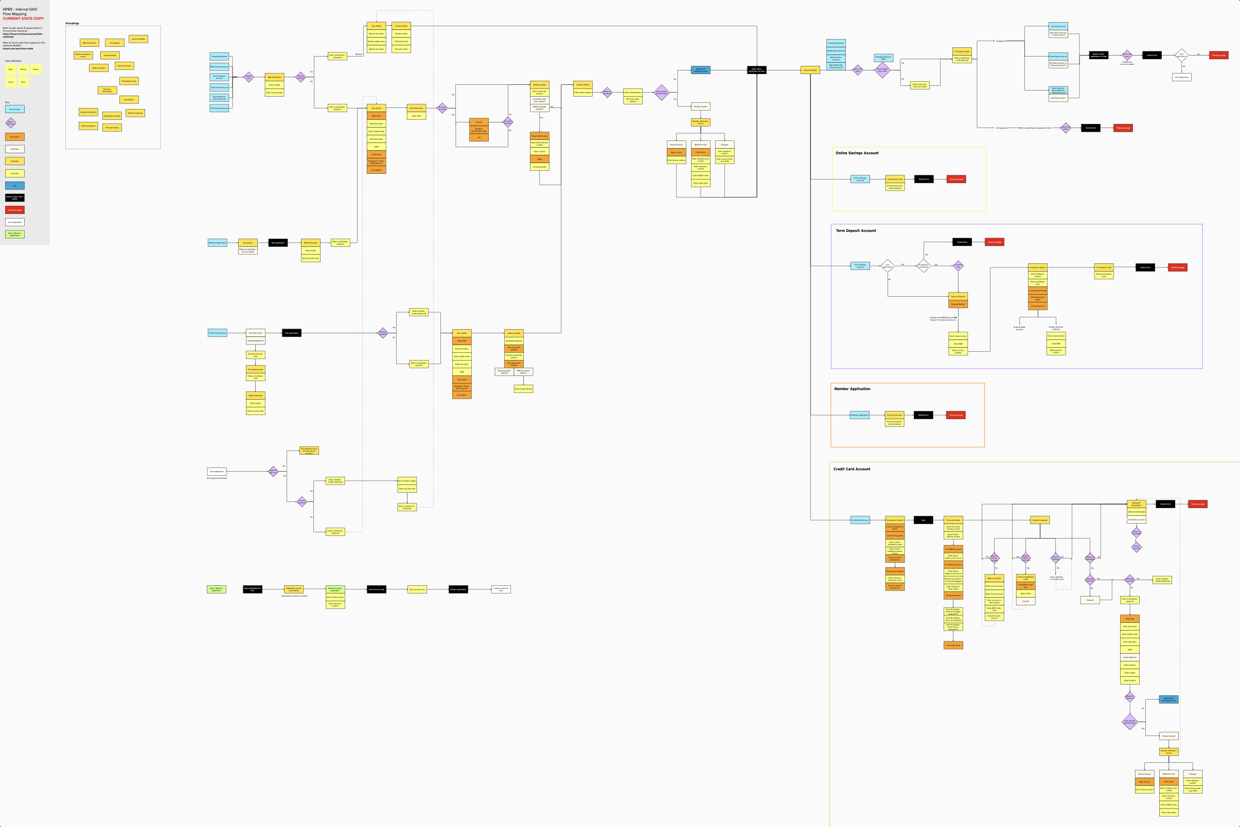
Mapping key user flows | Mural
With a solid understanding of the problem space, we moved into ideation. Rapidly generating low-fidelity wireframes and user journeys for early testing. Our focus was on reducing cognitive load, simplifying decision-making, and increasing accessibility across devices. We also identified opportunities to reuse interaction patterns to improve consistency.
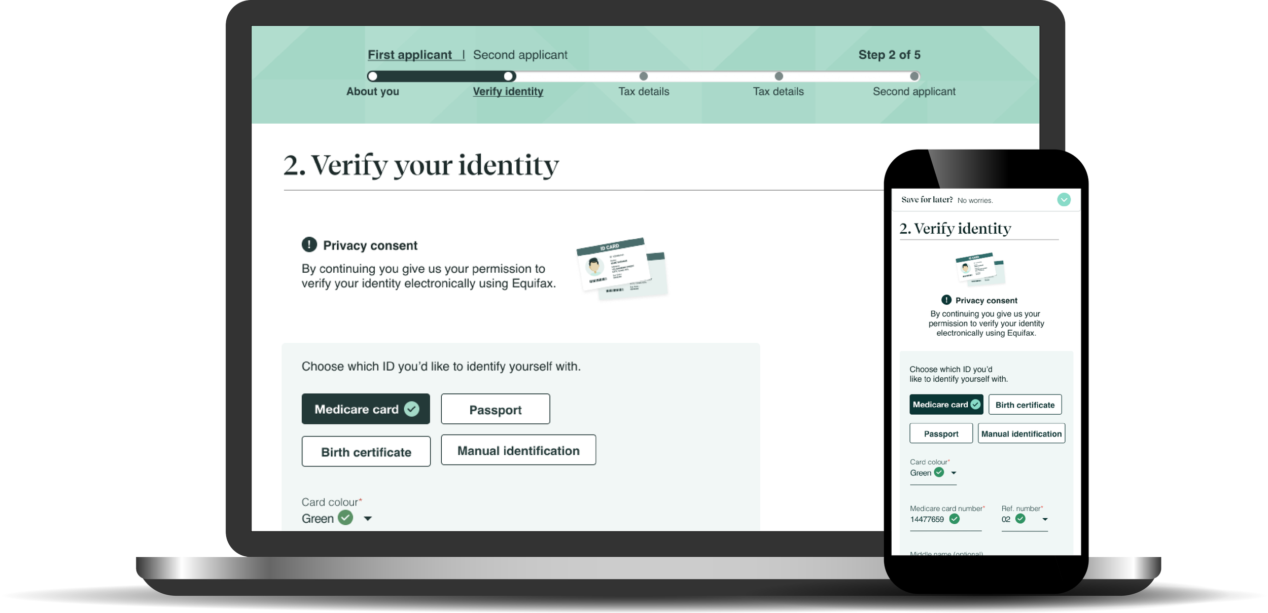
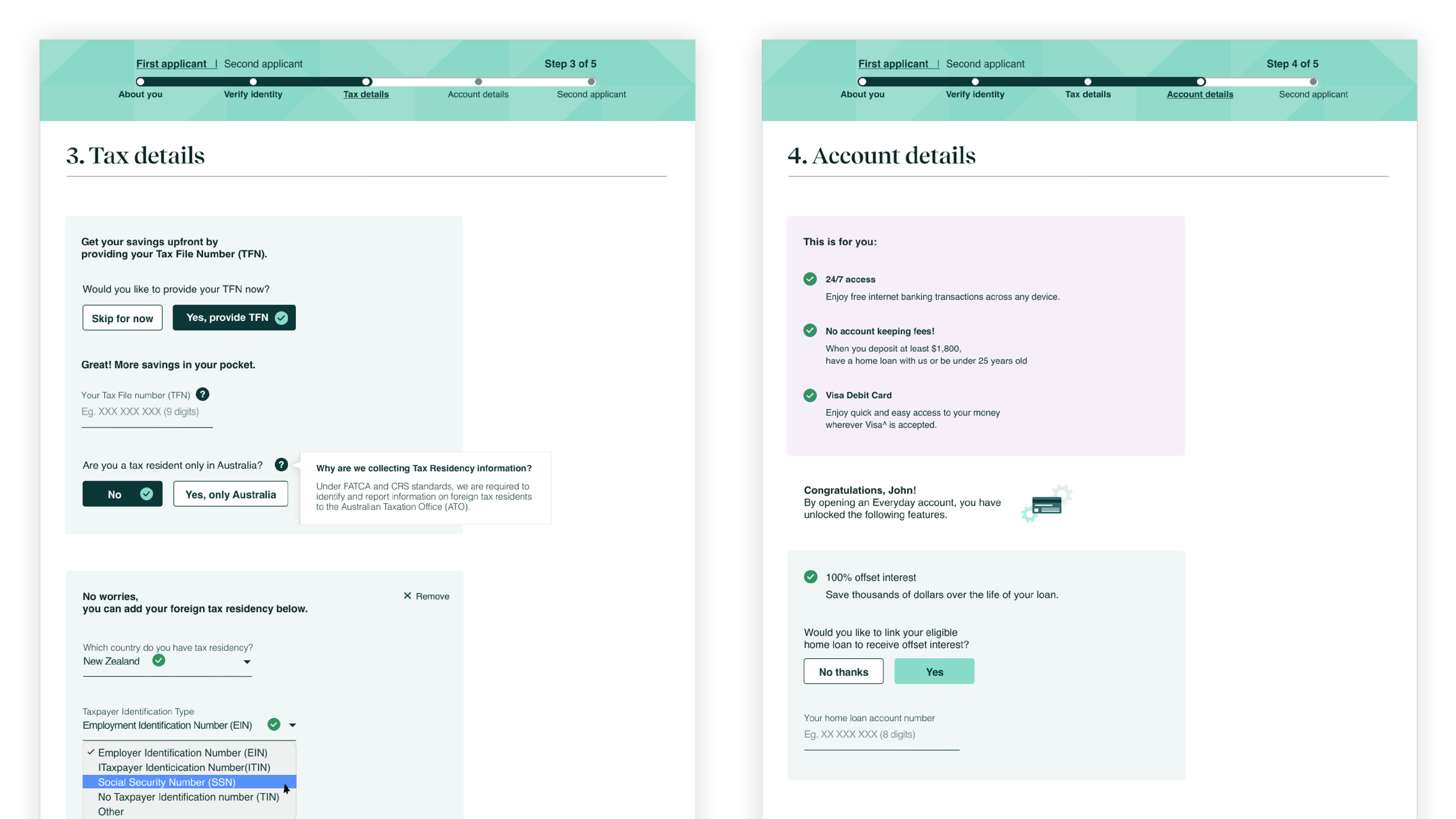
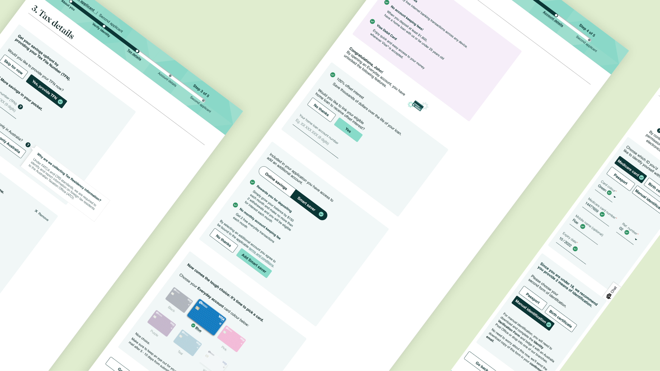
As the design matured, I translated wireframes into high-fidelity prototypes and began developing a scalable design system for the account opening experience. Designs were responsive from the start, ensuring seamless usability across mobile and desktop contexts.
We also collaborated with the bank’s brand and design team to create visuals that aligned with brand values and provided visual cues to support users throughout the journey.
Ideate: Wireframes, journey mapping, prototyping
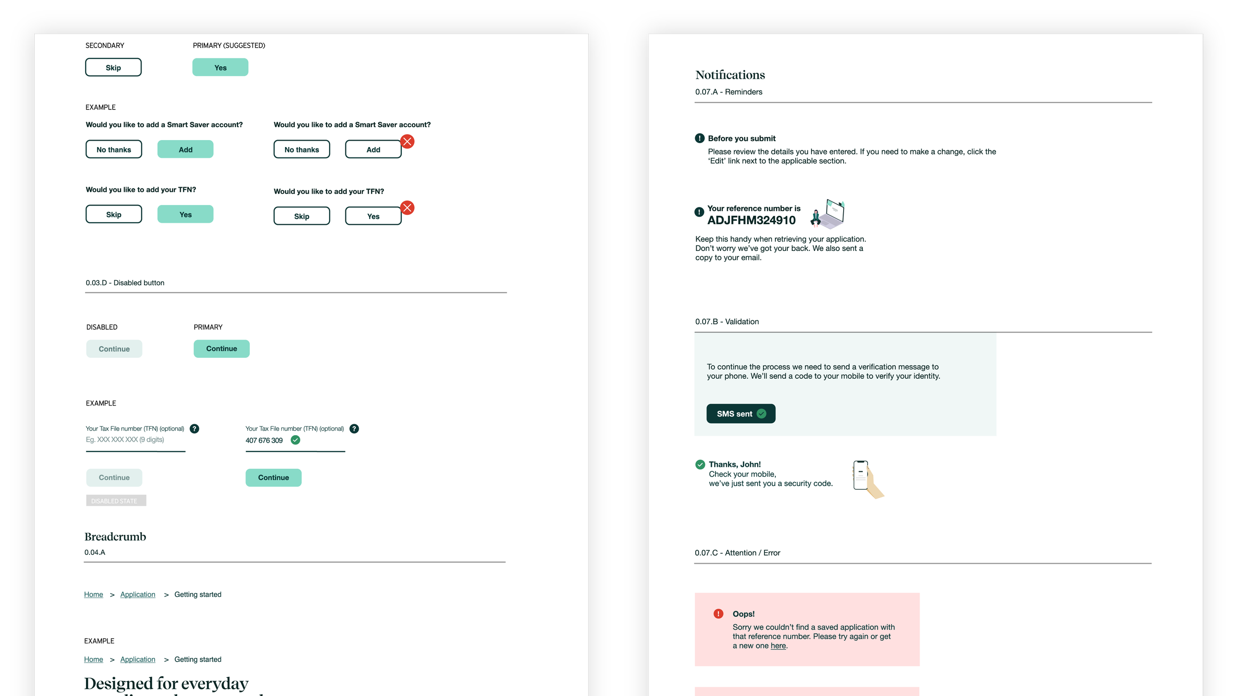
Design system | Figma
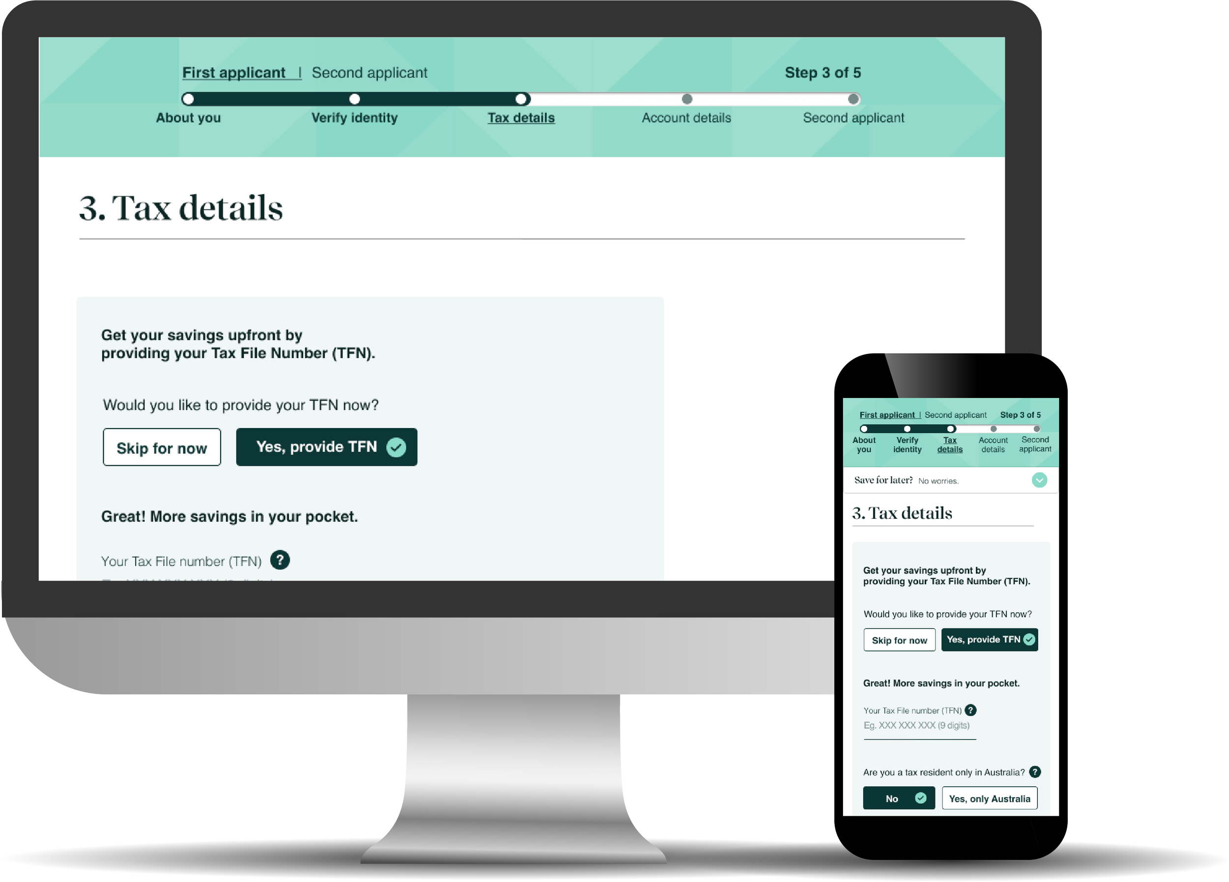
Responsive design prototypes | Figma

Email template designs | Adobe Illustrator
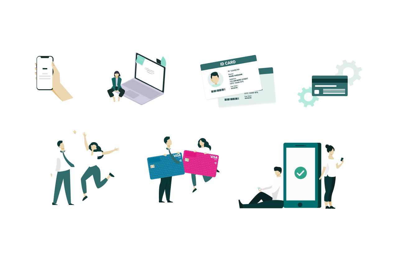
Illustration and animations | Adobe Illustrator
Validate: Usability testing, stakeholder engagement
Validation was a continuous thread throughout the project. We ran multiple design workshops and testing sessions with end-user representatives to gather feedback early and often. These sessions were structured around real tasks, giving us valuable insights into navigation clarity, form comprehension, and content tone.
Concurrently, we maintained a strong feedback loop with internal stakeholders and SMEs. Our weekly backlog reviews, stand-ups, and regular check-ins ensured alignment with sprint goals and helped resolve blockers before they could derail progress. Validating assumptions in real time helped us fine-tune interactions while maintaining flexibility to adapt as development evolved.
Validating workshop: User flows & design components | Mural
Deliver: High-fidelity UI, developer collaboration, iterative improvements
As we moved into delivery, I ensured that our high-fidelity UI designs reflected our usability learnings while adhering to the bank’s technical architecture. Our headless single-page application was built using React, and I worked closely with the dev team to align component behaviour with backend feasibility and performance constraints.
We created a reusable component library and established a scalable UI design system tailored to account opening needs supporting scalability for the banks’ future products. All interfaces adhered to WCAG AA standards, ensuring inclusivity and compliance. After handoff, the team continued monitoring via integrated analytics (Google Analytics, GTM) and participated in iteration discussions based on real usage data.
UX Acceptance Criteria | Confluence
Our solution
Our solution reimagined the online account opening experience to be intuitive, responsive, and accessible across all devices. By simplifying complex workflows, designing inclusive interfaces, and introducing digital pathways for manual applications, we delivered an upgraded user experience that aligned with both customer needs and operational processes.
Built with a scalable design system and WCAG AA compliance in mind, the interface reflects a modern digital standard for the bank. The new forms leverage smart logic, progressive disclosure, and clear visual guidance to help users complete their goals with ease.
The impact
Throughout development, the team integrated analytics to track user behaviours, such as form abandonment and progress saving. These insights informed real-time design refinements and future iterations. The results demonstrated a significant uplift in digital adoption:
365% increase in online account openings.
530% uplift in multiple accounts opened per customer.
1,475% increase in minors and youth accounts.
Reduced staff intervention from 45% to 30%
This project also marked one of the bank’s first cloud-hosted solutions, setting a precedent for future digital initiatives.